- Home
- Papercraft Adhesives
- Making Retro Projects
Retro Layout
Written and Created by PaperCraftCentral Susan
This retro layout project also features a sponged background and a way to make paper flowerslook a bit older.
"Retro: Involving, relating to, or reminiscent of things past; retrospective"
~American Heritage Dictionary
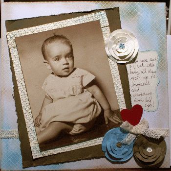
This retro layout has been made using a very old photograph
from the 1950s that was printed in sepia.
I had been thinking about creating a layout with it for a long time as I was not sure how I wanted to scrap it, or even if I was brave enough to do so, but one day I laid a piece of my Soft Suede cardstock (now retired, but choose a medium brown coloured cardstock instead) alongside it and it seemed so right, I was encouraged to take the next steps.

How I Made my Retro Layout
It can be daunting to scrap older, original photographs yet so satisfying if you make something that pleases you. Of course I was careful and tried out my layout in many ways before committing myself to a final decision.
When you decide on a layout you like, remember to remove each layer of elements separately so you can glue the back layer first, then the next layer, finishing with the layer that lies on top of everything.
Or you can adhere things down loosely, at just one point for example, so you can still slide other elements underneath each layer randomly. Then you can add more glue later when you are happy with your work.
In this case, I finally decided I could wait till the last minute to adhere the actual photo down if I went ahead and created a background for it, and I could also scan and reprint the photo if I decided I still didn't have the heart to adhere it to the page.
There are always options in papercrafting, and that is something I love about this hobby.
I decided the frame needed to have texture for this picture. I ran some Very Vanilla cardstock through my Die Cut and Embossing Machine with the Square Lattice Textures Impressions embossing folder. (This embossing folder is now unfortunately retired. It was a favourite of mine. You can choose to use another folder with a pattern that is more condensed rather than open if you want to recreate the same effect). I trimmed it into strips of paper to form a frame which I then sponged with Marina Mist and Soft Suede inks 9Both retired. Choose a sea blue and a medium brown colour from your stash instead).
I distressed the edges of my Soft Suede cardstock and bent it around a little.
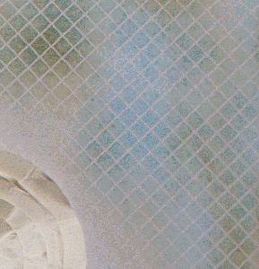
Then I found some Basic White designer series paper that had been heat embossed in a diagonal pattern.
I used my sponges and inks to make the background pop and seem weathered.
I used Soft Suede and, since this was a photo of a little boy, Marina Mist ink.
Pink would have worked wonderfully with the subtle colours in the photo but I just couldn't choose pink. Perhaps I could have used Crisp Cantaloupe (retired) or another peachy coloured ink though? Oh well. I chose the blues instead.

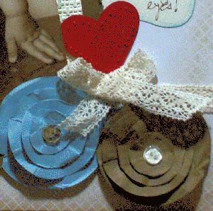
Then I wanted to make some tattered flowers that were still simple, like the background and the photo. I didn't want to overwhelm that photo. So I took some graduated circles cut from both Marina Mist and Very Vanilla cardstock by my Stampin' Die Cut and Embossing machine and scrunched and distressed each circle.
Then I stacked the circles together to make the flowers, ruffling them up till I liked the look and sticking the layers together with mini glue dots.
I finished the middles of the flowers off with some stamped and punched mini Itty Bitty shapes and their matching buttons (both now retired but again, use small punched shapes and buttons that you like from your stash).

You can see I finished the main embellishment off by punching and paper piercing a heart and finding some Chantilly Lace (retired) to tie into a sweet little bow.
The journalling block was cut with the Stampin' Die Cut and Embossing Machine using the Top Note die, (retired) then sponged as well.
I was happy with my retro layout in the end. I hope you agree that the photo has not been overwhelmed. I wanted it to be the main focus of the page and think that happened, happily!
Stepping It Up
On reflection, I might add another smaller heart to the red one, to make the red stand out less. I think I need to emboss it too and will probably make it out of that embossed Basic White and grunge it up a little with some Soft Suede/medium brown ink. I would also add some retro embellishments to the joins in the frame. I think I may have some little bronze metal embellishments that might work.
What do you think? Should I do that? Or is this retro layout now finished?
Return from Retro Layout to Scrapbooking | Return to How to Make Paper Flowers | Return to PaperCraftCentral Home Page


New! Comments
Have your say about what you just read! Leave me a comment in the box below.